-
Architects: Mei architects and planners
- Year: 2015
-
Photographs: Jeroen Musch, Ossip Van Duivenbode, Frank Hanswijk
-
Manufacturers: Glasimpex, VPT Versteeg
-
MEP: Sweegers & de Bruijn, ‘s-Hertogenbosch

Text description provided by the architects. Shining McDonald’s in heart of Rotterdam
After a very fast construction period of only two months a spectaculair new pavilion shines in the heart of Rotterdam. Mei architects and planners designed this new McDonald's pavilion on Coolsingel Rotterdam. The former kiosk was once voted the ugliest building in Rotterdam and no longer reflected the wishes and ambitions of either McDonald’s and the city of Rotterdam.

Rotterdam has recently showed up in the top 10 of 'places to go' of the New York Times and the Rough Guide. This new pavilion is an architectural masterpiece that adds to the series of Market Hall, Central Station and Fenix Food Factory. It is a welcome asset to Rotterdam, the city of architecture.

Connection with the city
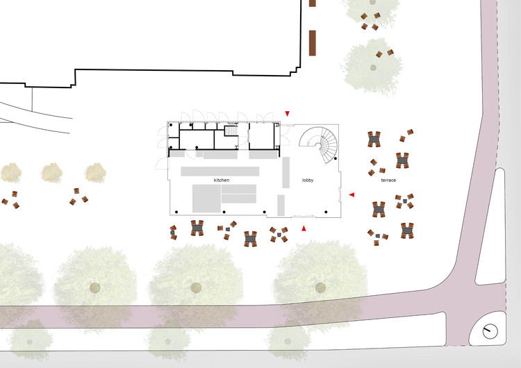
The new building volume has been carefully detailed and articulated by Mei to open up views of the monumental post office behind it. As a result, the pavilion has the most compact possible core, with glazed façades all around. A fully transparent lobby, with entrances on three sides, makes it seem as though the public space flows through the building.

To strengthen the connection between the pavilion and its surroundings, the outdoor terrace will feature the same furniture found in other public spaces in the city of Rotterdam.

A shining pavilion — day and by night
Like the historical buildings in the area, the pavilion features a richly articulated façade, carried out in one single material: gold anodized aluminum. This warm and elegant-looking material is vandal-proof and enduring at the same time.

As McDonald’s is open day and night (24/7), its appearance after dark is important. By day the building is inviting to shoppers, while in the evening it glows to attract the nightlife crowd. The skin is perforated with heart-shaped openings to form a ‘veil’ around the glazed building through which illumination shines. This skin is continued in the interior walls and ceilings.With the application of various degrees of perforation, the façade depicts a crowd of people on Coolsingel. After all, the new McDonald’s is built for the people of Rotterdam, who now have yet another reason to be proud of their city.

Integrated power boxes
The various power boxes for utilities and traffic regulation systems, always an eyesore on the street, are integrated into the building. Moreover, the incorporation of illumination into the façade will enhance safety on the street. Technical installations are integrated within the roof, which is designed as a fifth façade.

View on Coolsingel
Counter and kitchen are located on the ground floor. A one piece steel spiral staircase leads from the lobby to the seating area on the first floor. From here the visitors have a beautiful panorama view overlooking Coolsingel.


